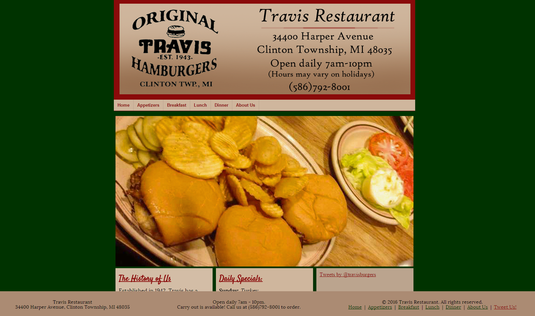
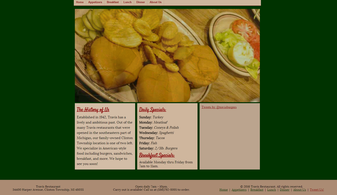
| | The first page of our website turned out really cool. It looks like a mixture of a lot of big name restaurant's websites. I don't really have a favorite feature because I think alone, the features are boring, but with everything put together, it works. If I had to pick one, I guess it would be the layout because it holds all the pieces of the site where they need to be and it's the basis of the website. My least favorite feature would be the twitter widget because it really bothers me that it doesn't show up on our computers so it is just a block of unfilled space. I know that it's there, I'm just a perfectionist so it bothers me that it's not visible. I would rate it a 9. Nine only because we want to do something to the background using the pattern of Travis' booths, but the pattern is really busy. I think we are going to try pulling components off and using them on the sides of the layout, otherwise we may just leave the background as is. |
|
0 Comments
Leave a Reply. |
CaitlinWelcome to my web design blog! Archives
February 2016
Categories
All
|
 RSS Feed
