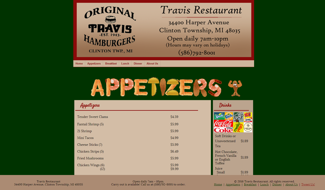
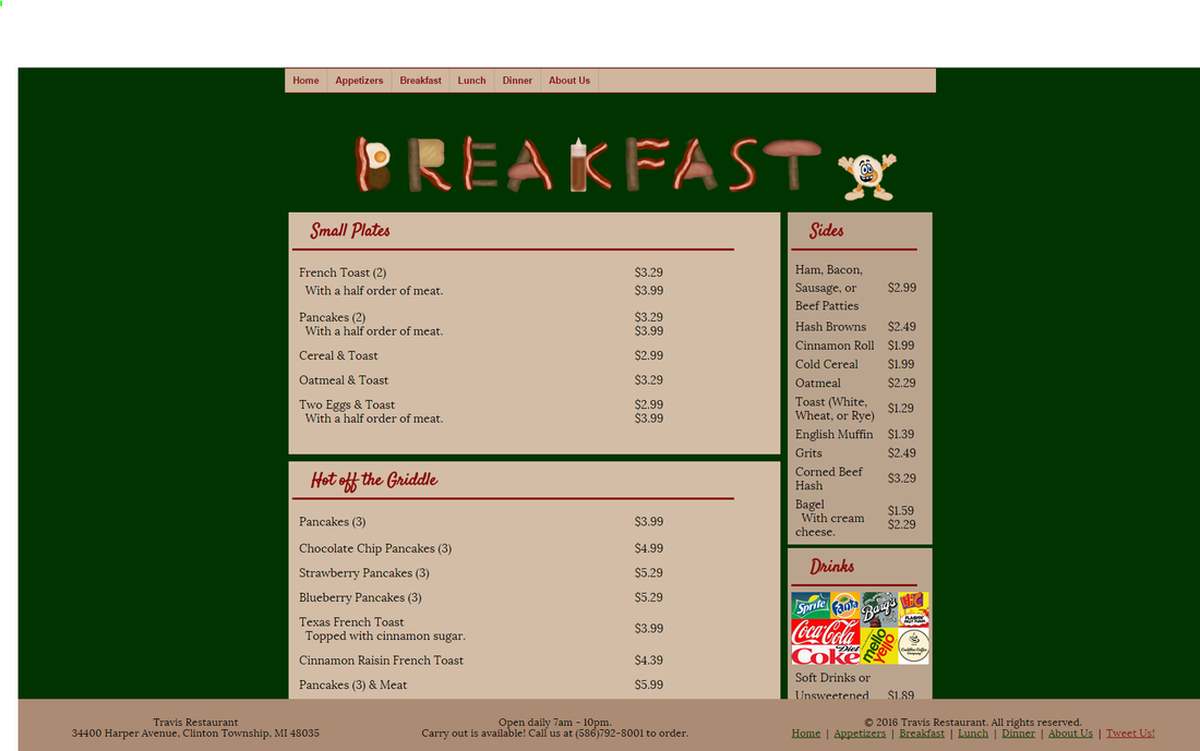
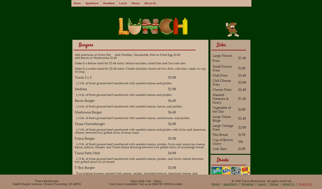
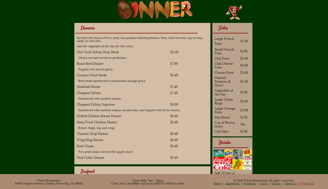
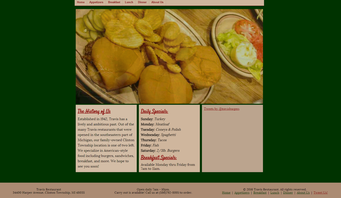
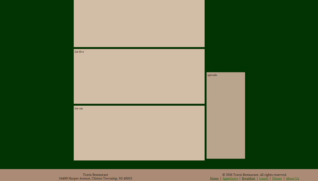
| | I am most proud of the lunch page. The heading graphic is really nice and the lunch page took me the longest to get the menu sections right. I am least proud of the breakfast page, but only because of the tooltip error in code. Other than the tooltip problem, my least favorite is the appetizers page since it is the shortest page and it has one less side section than the other pages. These pages were probably the most difficult pages I have had to create. The menu items took me about a week and a half to get all typed out and added to the sections. The best part was creating the graphics for these pages. |
|
1 Comment
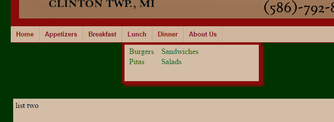
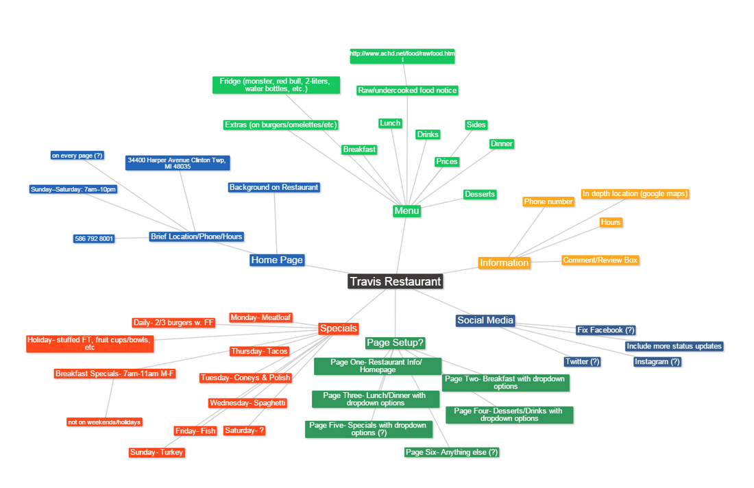
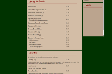 This week I began plugging in Travis' menu items onto our 4 menu pages. I created sub-sections and adjusted the height of them and the div they are contained in based on the space needed for the content. Each sub-section has a heading. The headings were made into anchor tags. With a little help from a forum, I managed to find out that a piece of the code had been deprecated and that was why the links in the drop down navigation would not connect with the anchor tags.
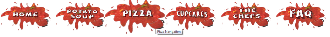
Image Bubble Effect The first row is the files and code needed for the bubble navigation effect. The last two rows are the images I used in the code so that you can what pieces to change.
Tooltip Effect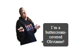 The HTML document does not have much code, only about two lines that are needed. The CSS document has a website at the very top for if you want the tooltip to be on a different side than it is in my example. Olivianne.png is the image I used for the tooltip.
After reading this article, I found some things agreeable and disagreeable. Scrolling seemed like a waste because I believe it's really a matter of opinion and circumstance as well as usage. I don't mind scrolling, unless I'm doing something on a website where one piece I need is near the top and the other is near the bottom. I liked the aspect of the navigation constantly changing because I don't usually like the ordinary rectangular boxes. I like the unique designs that can flow well with the layout. I like the flashy layouts that make certain things more noticeable than others because it makes things easier to read so I like the idea of them constantly growing to become a more aesthetic appeal. Usability has also always been a concern in my book, but if you can make a usable site, you can create a layout to at least make the site aesthetically appealing.
|
CaitlinWelcome to my web design blog! Archives
February 2016
Categories
All
|
|||||||||||||||||||||||||||||||||||||||||


 RSS Feed
